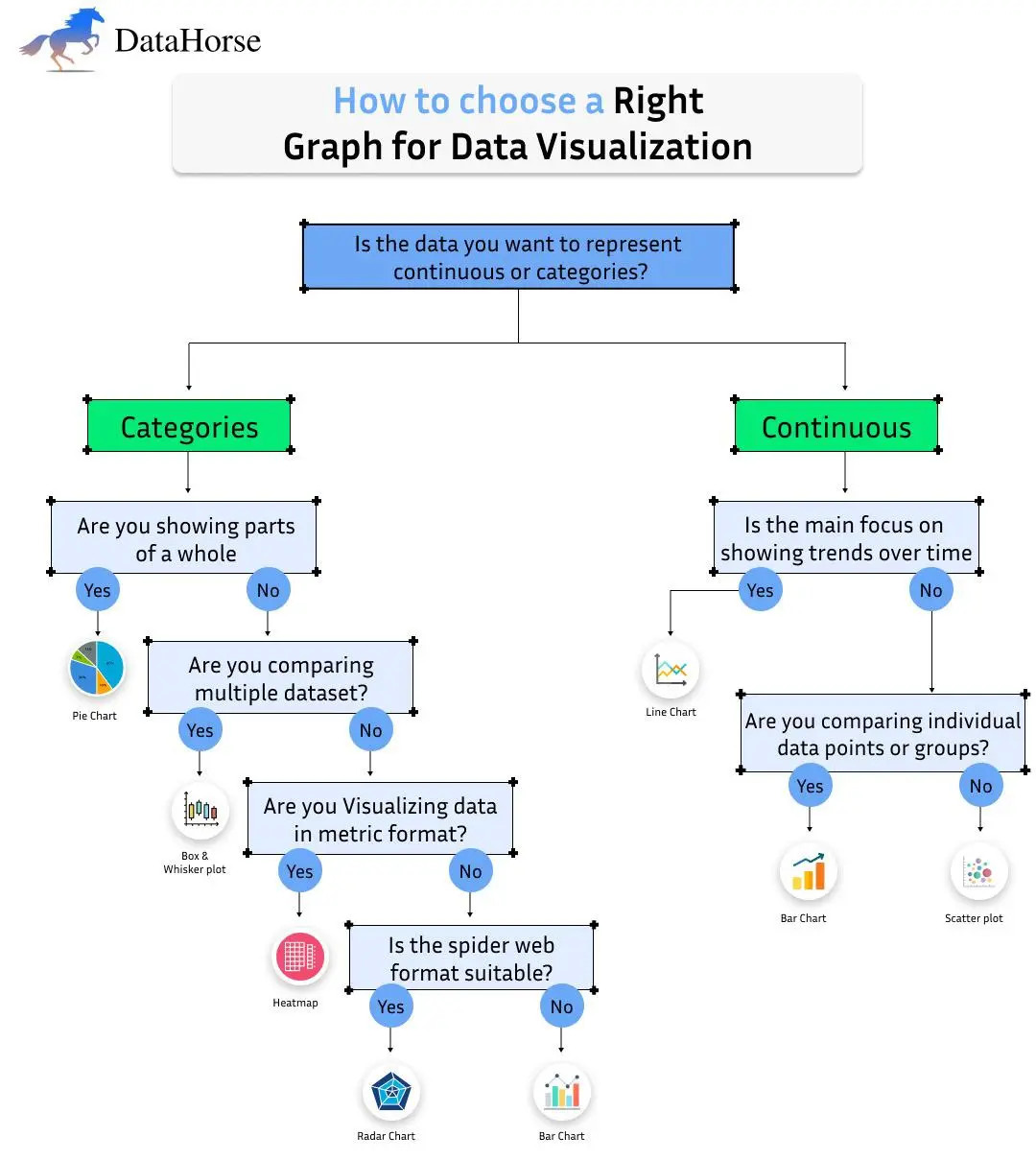
Selecting the right graph for data visualization is key to effectively communicating data insights. The type of data—whether categorical or continuous—greatly influences your choice. This guide will walk you through the decision-making process, helping you select the most appropriate visualization for your data.
Step 1: Categories vs. Continuous Data
The first step in choosing the right graph is identifying whether your data falls into categories or is continuous. This simple decision narrows down the available graph options.
- Categories:
Data that falls into specific groups, such as product types, colors, or regions.
- Continuous:
Data measured on a scale, such as time, temperature, or income levels.
For Categorical Data
When working with categorical data, ask yourself the following questions to determine the right chart:
1. Are you showing parts of a whole?
If you're trying to show how different parts contribute to a total, a pie chart is your go-to visualization. Pie charts are great for showing proportions or percentages, such as market share distribution or survey results.
2. Are you comparing multiple datasets?
- If yes, consider a box and whisker plot. This chart type is ideal for comparing data distributions across different groups or categories. It displays data quartiles, medians, and outliers, making it perfect for comparing multiple datasets.
- If no, continue to the next question.
3. Are you visualizing data in a metric format?
- If yes, a heatmap is an excellent choice. Heatmaps use color gradients to represent data values in a matrix format. This is useful for visualizing large datasets, such as customer behaviors or product performance, where patterns are more easily spotted with color.
- If no, ask whether the spider web format is suitable.
- If yes, go for a radar chart. Radar charts (also known as spider charts) allow you to compare multiple variables in a circular format. They are useful when comparing the performance of different categories based on multiple criteria.
- If no, a bar chart is a simple yet powerful choice. Bar charts are one of the most widely used visualizations for comparing categorical data, such as sales numbers by product or region.
For Continuous Data
If your data is continuous, focus on the following:
1. Is the main focus on showing trends over time?
If you're trying to visualize changes over time, a line chart is the ideal choice. Line charts are excellent for displaying trends in time-series data, such as stock prices, temperature changes, or website traffic. The continuous flow of data makes it easy to see trends, spikes, and dips.
2. Are you comparing individual data points or groups?
- If yes, a bar chart is a solid option for comparing specific data points, especially when the data is grouped into categories.
- If no, a scatter plot is the best choice for comparing relationships between two variables. Scatter plots are particularly useful when exploring correlations or patterns, such as age vs. income or sales vs. advertising spend.
Why This Matters
Choosing the correct graph is essential for conveying your message clearly and accurately. A mismatch between the data type and the graph type can lead to confusion or misinterpretation. For instance, using a pie chart for data that isn't part of a whole may confuse the audience, while using a scatter plot for time-series data might obscure key trends.
- Pie charts are best for illustrating proportions within a whole.
- Bar charts are versatile and can show both categorical comparisons and individual data points.
- Line charts emphasize trends over time.
- Box and whisker plots excel at showing data distribution and variability.
- Heatmaps offer a quick overview of large datasets with a focus on color-coded value intensities.
Enhancing the Visualization Experience
Tools like DataHorse also aim to improve the user experience by enabling a more familiar interface. Upcoming improvements will include making the web app interface resemble tools like Jupyter Notebook or Google Colab, giving users a more intuitive and familiar environment to work in.
Conclusion
Choosing the right type of chart helps tell the right story with your data. By following this step-by-step guide, you'll be able to make informed decisions about your data visualizations, ensuring that your audience can grasp your insights with ease. With tools like DataHorse, you can further simplify this process, streamlining both the visualization and reporting stages of your data analysis.
Try DataHorse today and simplify your data analysis journey!